

LNK Enterprise Park
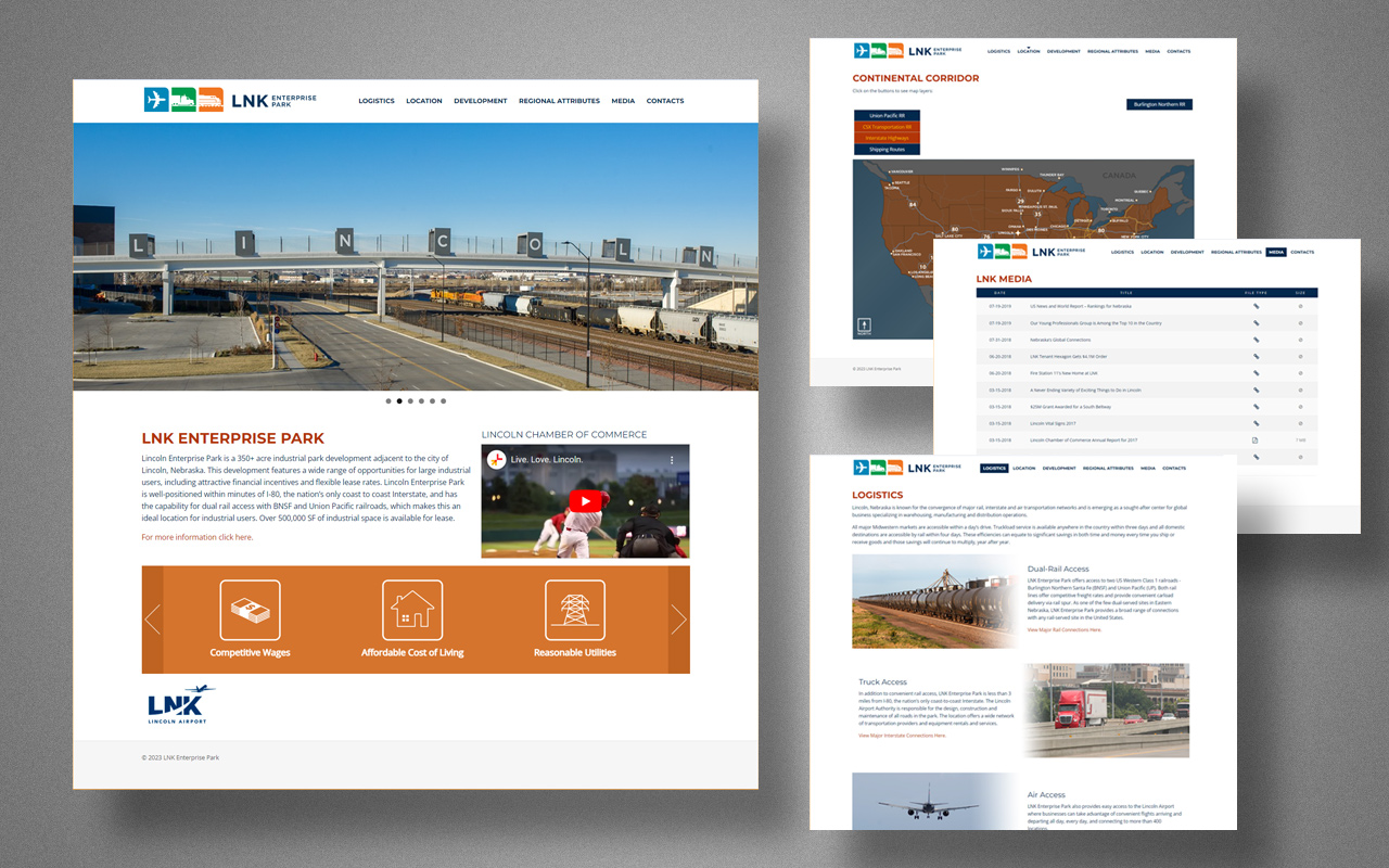
The logo mark originally represented “Nebraska Rail Park” before evolving into “LNK Enterprise Park.” Despite the name change, the brand mark’s direction remained consistent, symbolizing air, ground, and rail elements to represent the expansive 350+ acre industrial park. The choice of colors was inspired by each transportation mode’s environment – blue, green, and orange.
Following the logo’s completion, a website project was initiated to bolster their marketing endeavors. The website featured a user-managed backend, allowing them to update the latest development site information, post media content, and establish cross-links with strategic partners.