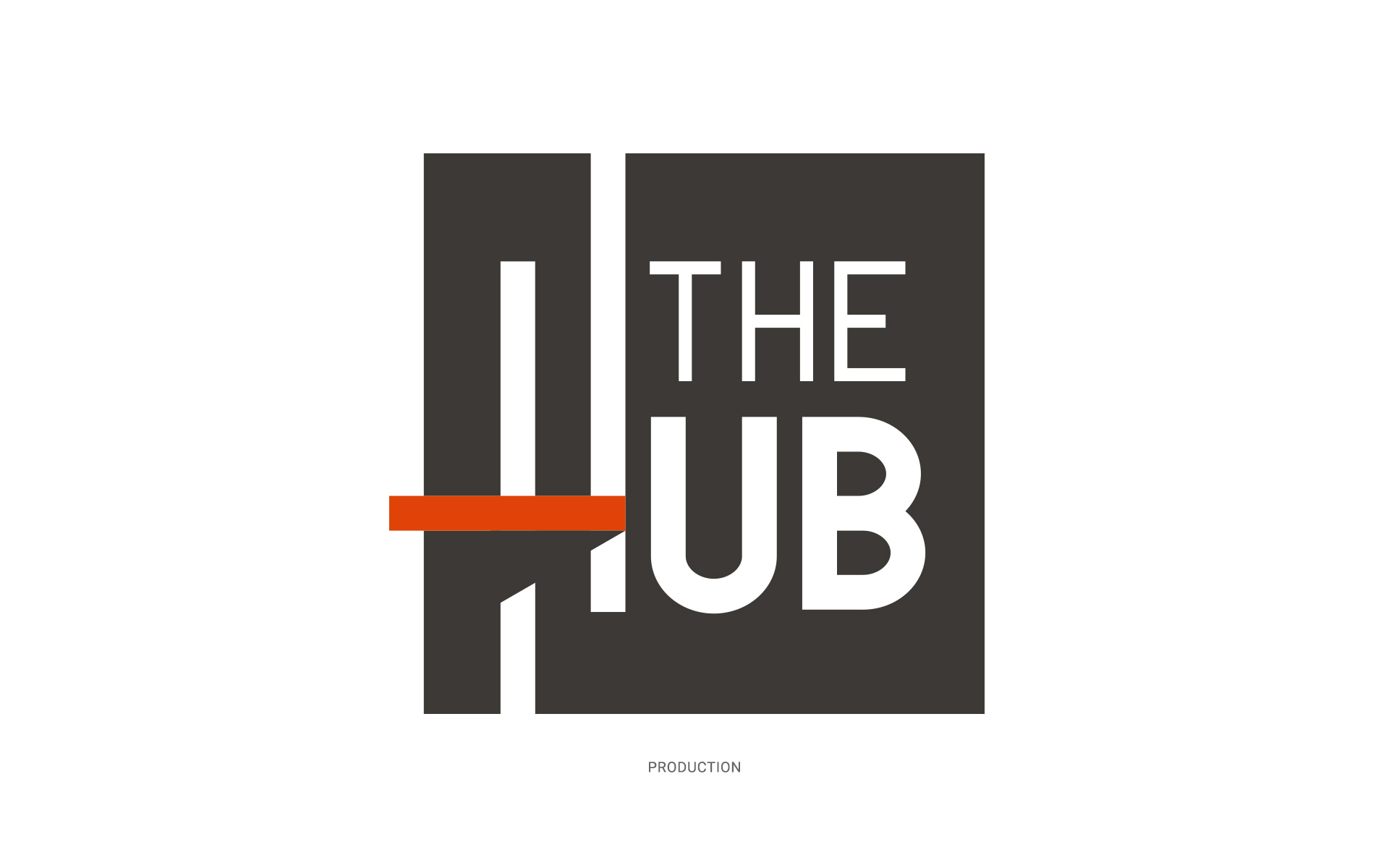
The Hub
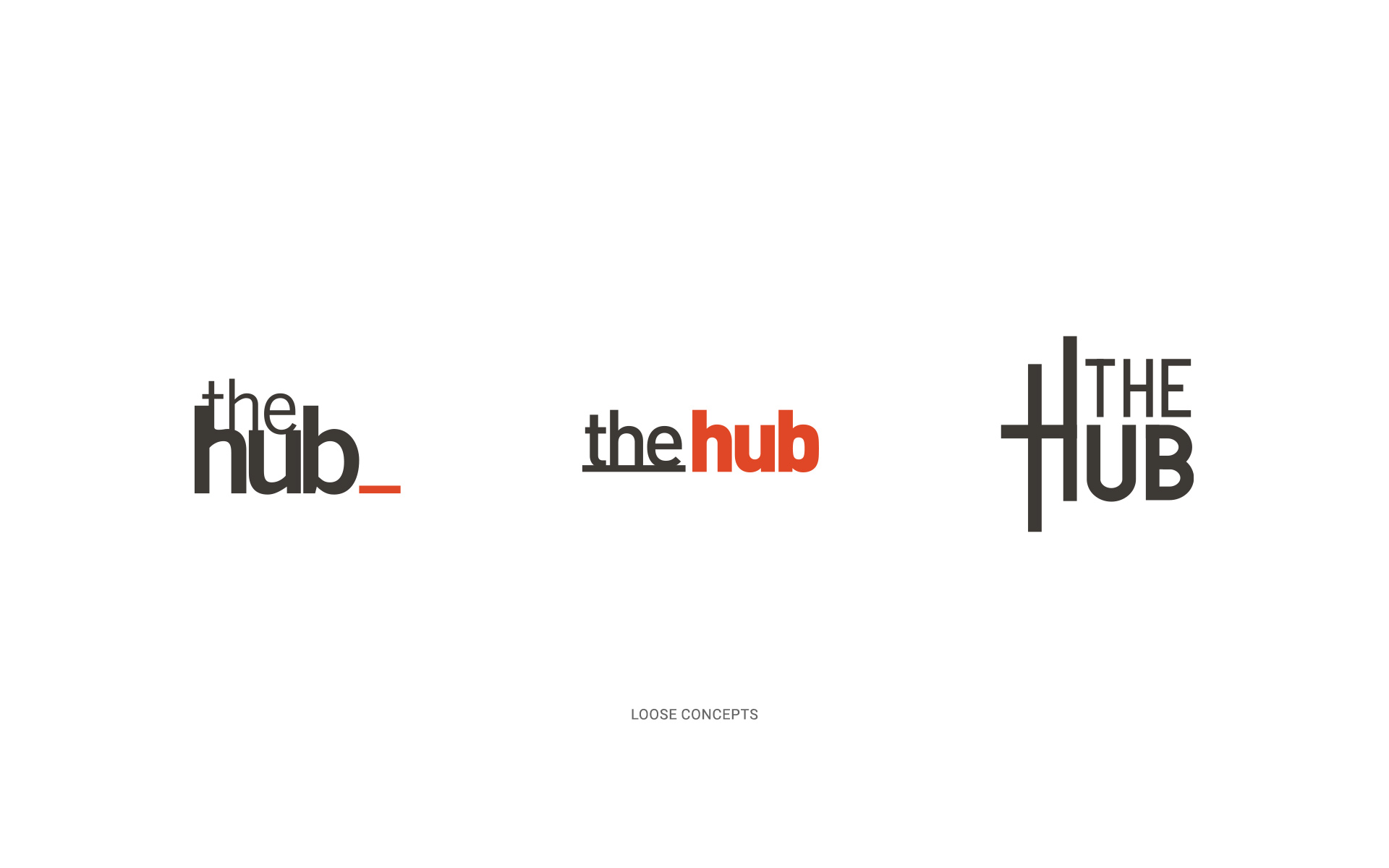
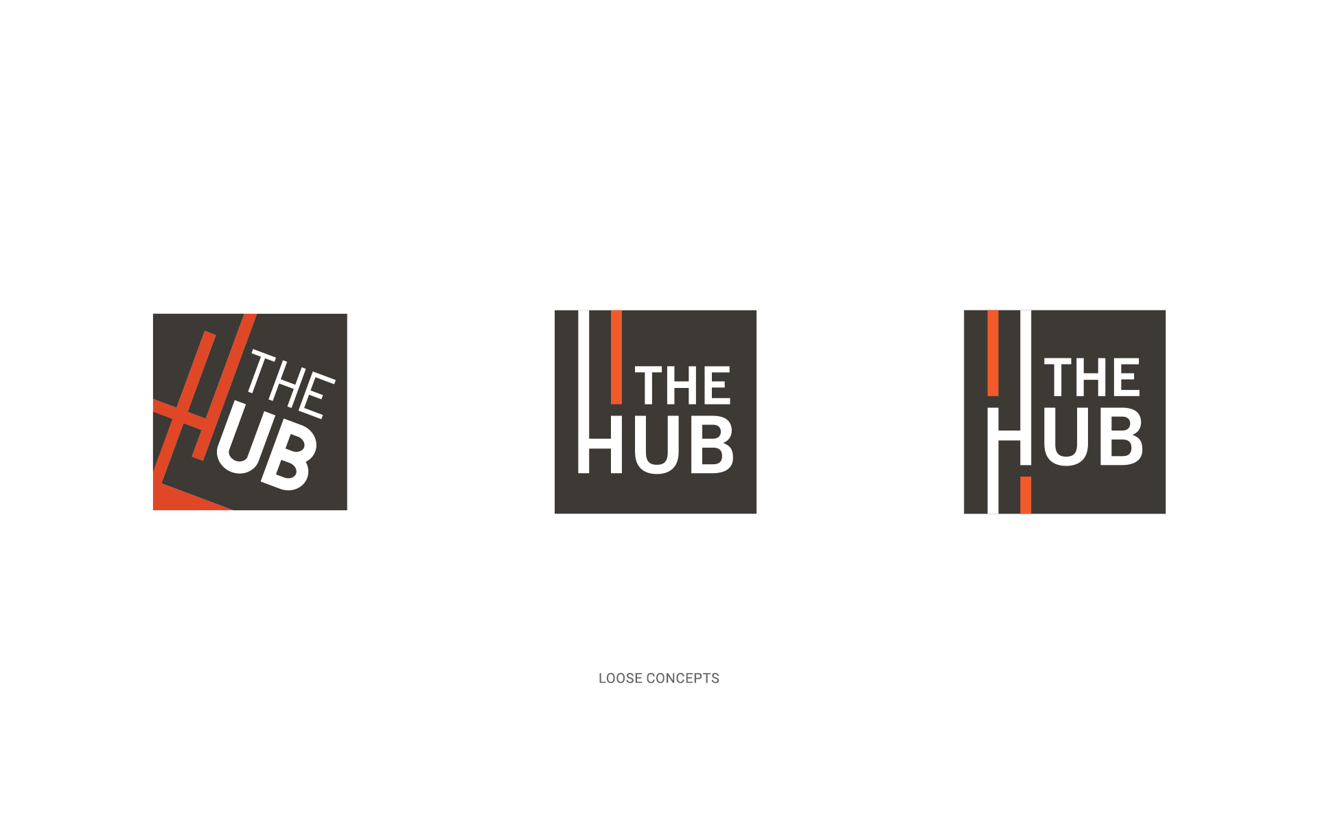
The Hub logo was created as part of branding for our corporate intranet system. The underlying concept revolved around using a line to symbolize both incoming and outgoing content within the platform.
In the end, we selected a final version that was enclosed within a square shape, with the corporate brand color, orange, extending beyond the boundaries to add a subtle yet distinctive detail. To enhance its visual impact, it has a subtle shadow effect on the orange bar, creating a 3D illusion that makes it appear as if it’s coming towards the viewer.